Montessori Landmarks in the Nursery
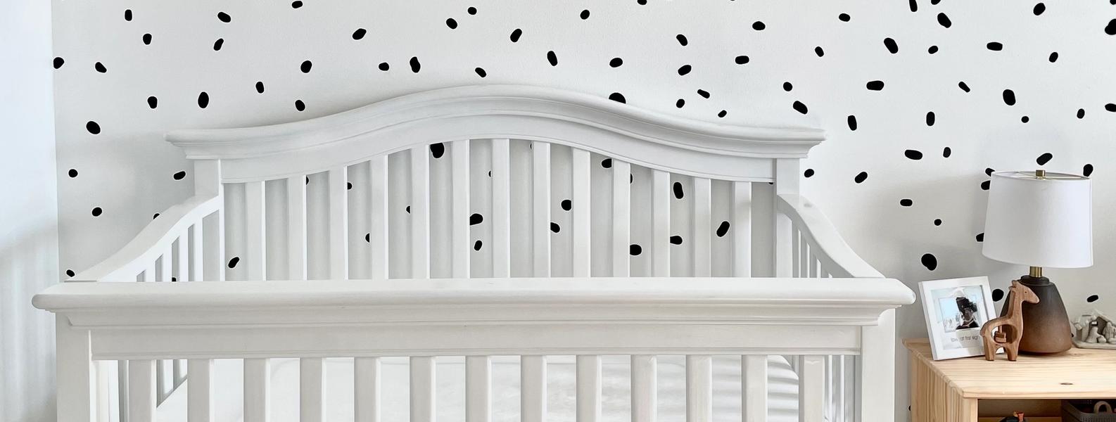
Throughout my pregnancy, we worked hard to create a safe and cozy space for our baby. We browsed Pinterest for hours, read the Montessori Baby by Simone Davies and Juanita Uzodike, painted, refurbished furniture, and hung materials. A few weeks before Ella arrived, we finished her nursery. In this blog post, I'm sharing the details of the nursery along with our reasons for some of those details (Links are found at the end.)
At home, we implement most of the Montessori philosophy. One of the foundational principles of Montessori philosophy is order.
In our baby’s surroundings, there needs to be a place for everything, and things needs to be in their place. The baby’s days and activities need to be predictable. We can help them by creating oorderly environments and developing routines and cues that will help them anticipate where they are or what comes next. We can make a place for everything — starting with a place for feeding, a place for sleeping, a place for physical care, and a place for movement and playing.
To help our baby with order, we provided physical landmarks or points of reference in Ella’s nursery for physical care, sleep, and movement. (On a side note, landmarks can also be a song and scent).
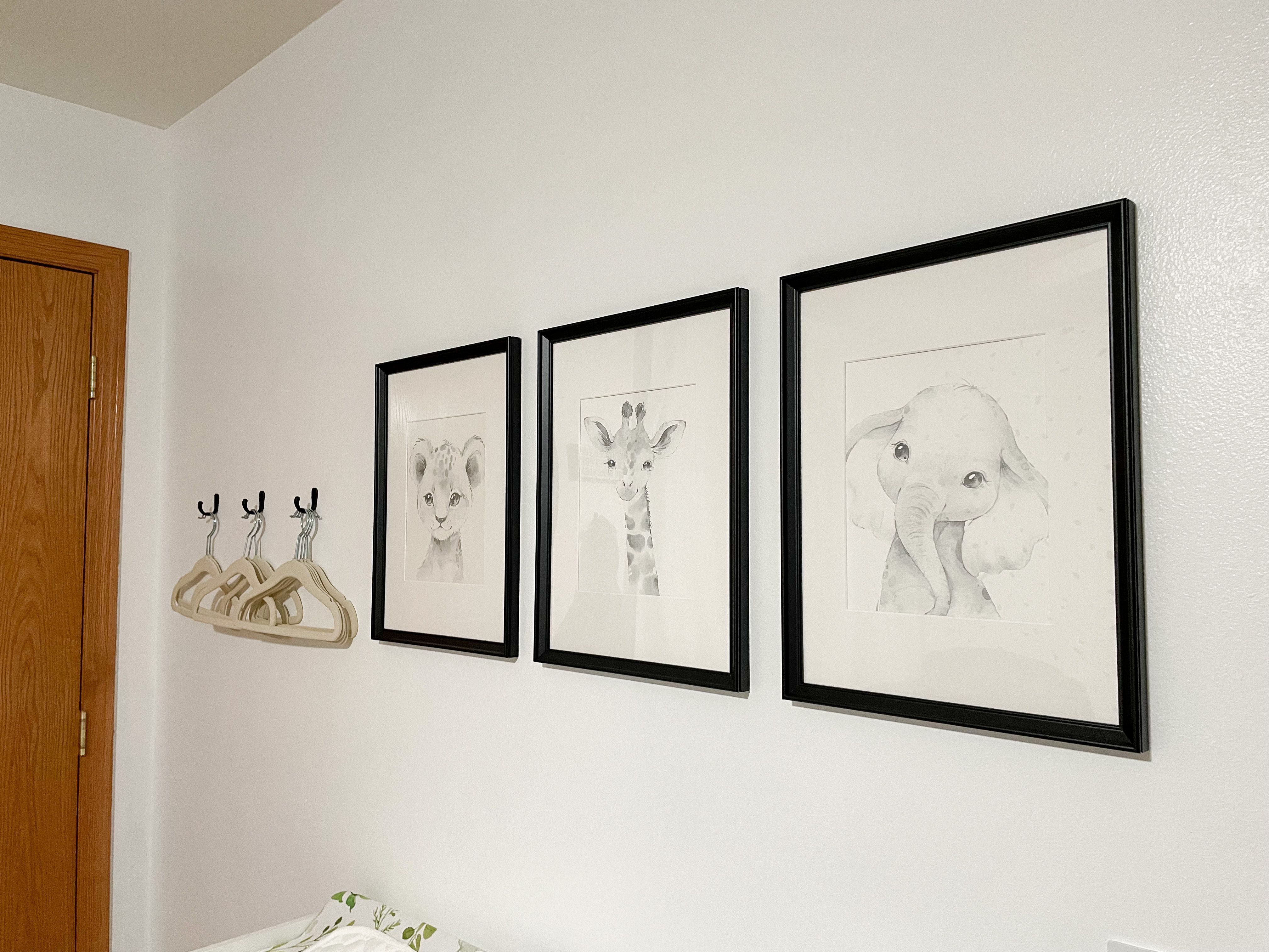
Physical Care Landmark
Where we provide physical care for Ella, there are 3 animals placed in black frames. These framed animals serve as a landmark for her changing area. We chose black frames because of babies' attraction towards high contrast objects. The height of them is not too far from the table because 0-3 month old babies can only see 8-12 inches.
Place of Sleep Landmark
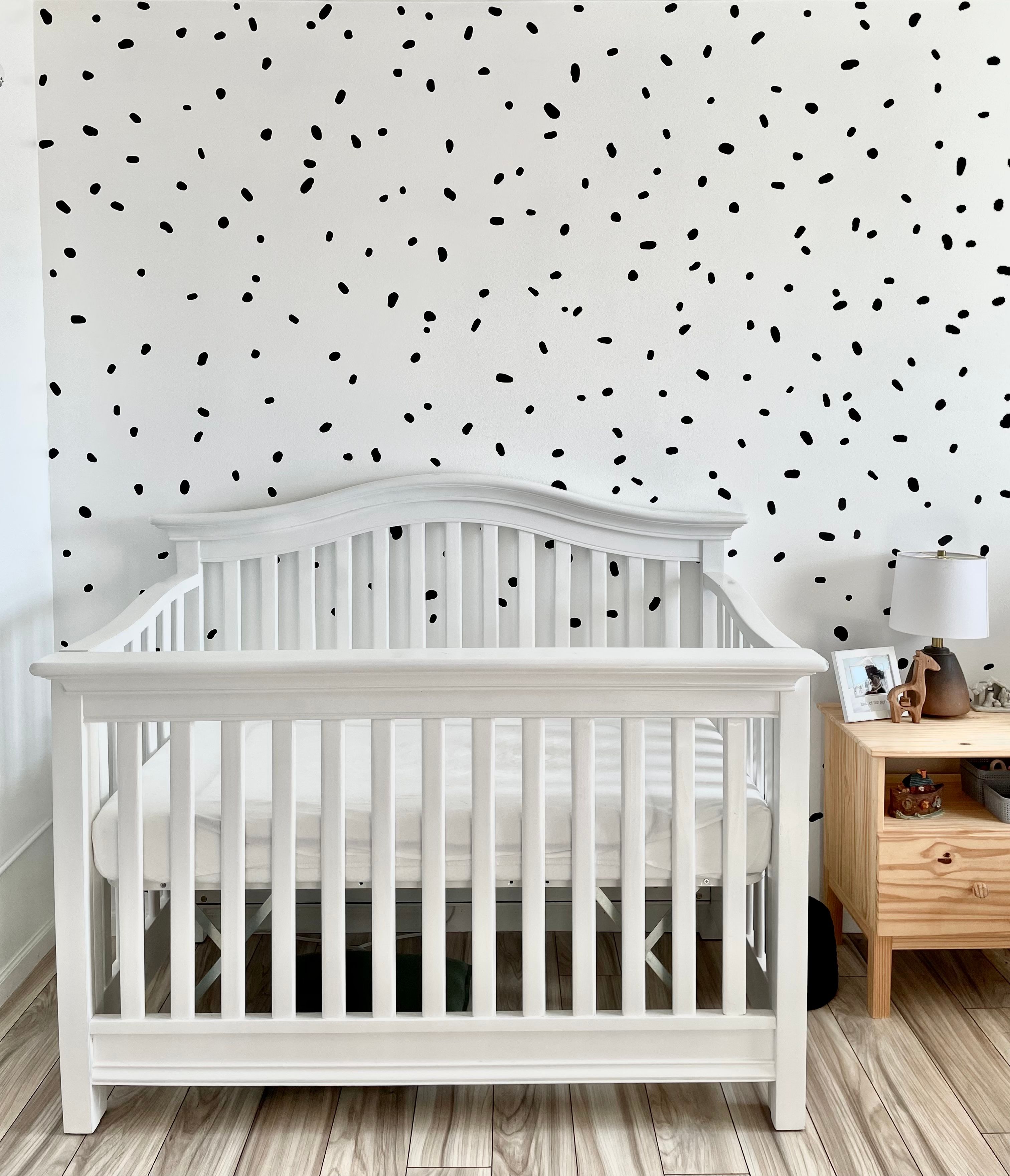
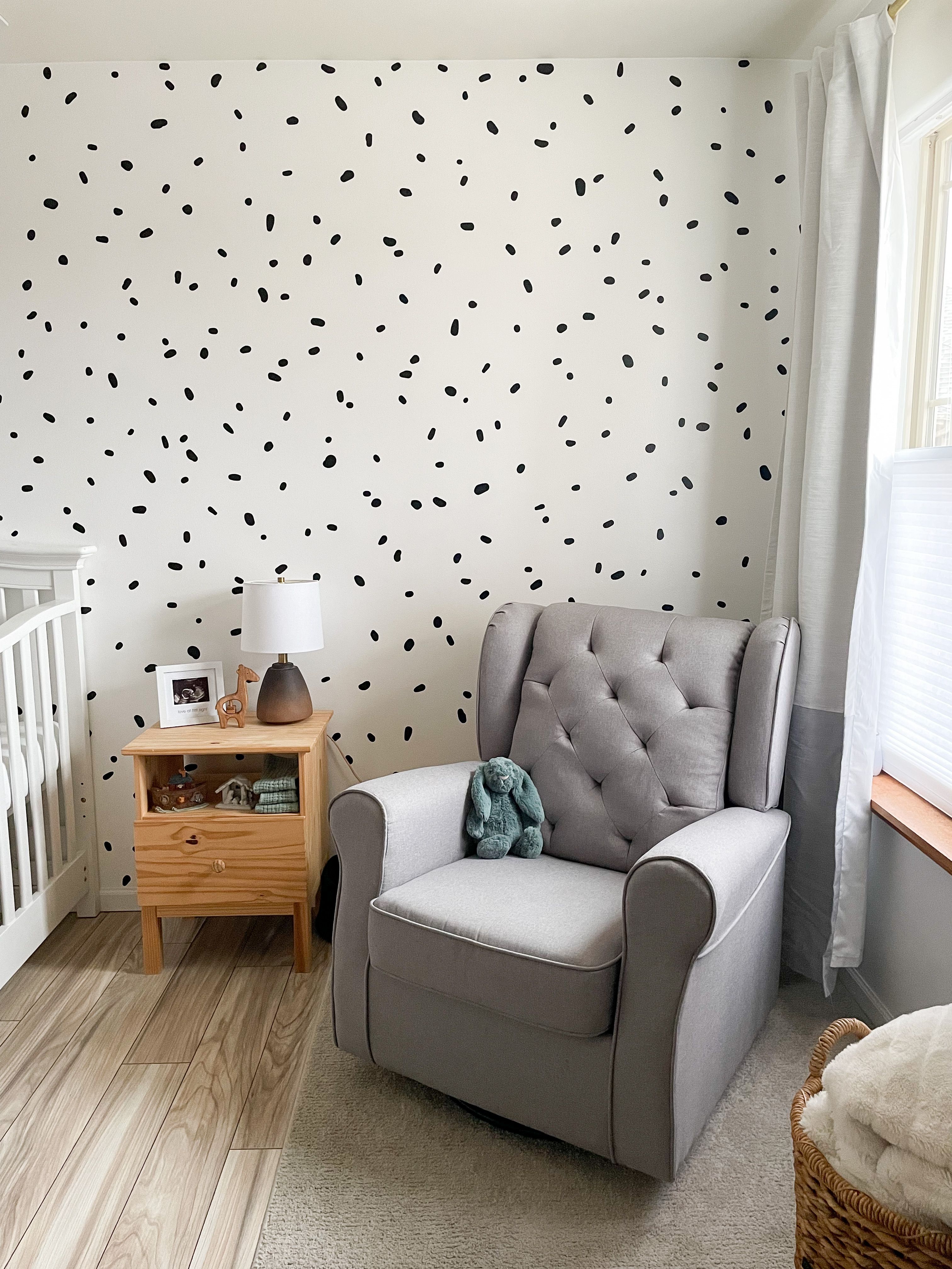
Instead of picking a theme for the nursery, we focused on picking colors that would benefit our baby at an early age. We chose black and white for the main colors of the nursery because babies can see tones of black (blurry tones) and research has shown that looking at high contrast objects is beneficial towards a baby's cognitive development. These black dots serve as a landmark for her place of sleep. We decided to place 500 black irregular dots on the wall. We ordered a thousand, but we noticed quickly that applying a thousand dots would be too busy. So, we used five hundred of them instead. It ended up being the perfect amount, and it was actually a very therapeutic activity. Here is a link to the dots we purchased.
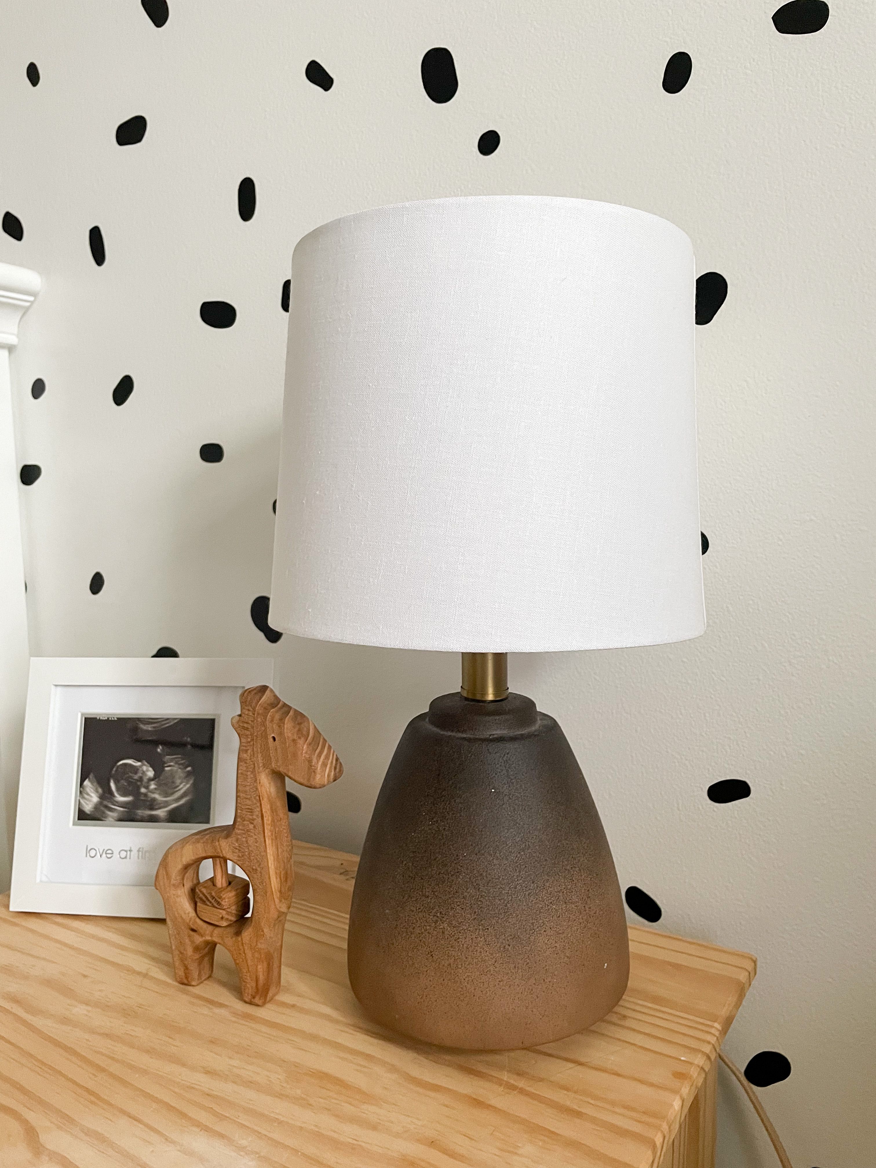
Movement Area Landmark
To create a movement area in the nursery, we took off the closet doors and used that space for it. At almost 3 months old, the physical landmark for her movement area is her lovevery play mat. As she grows in the coming months, the mirror near the floor will be a landmark for this area. It is the Nissedal mirror from IKEA. When Ella starts to crawl, we will need to cover the corners with a soft material.
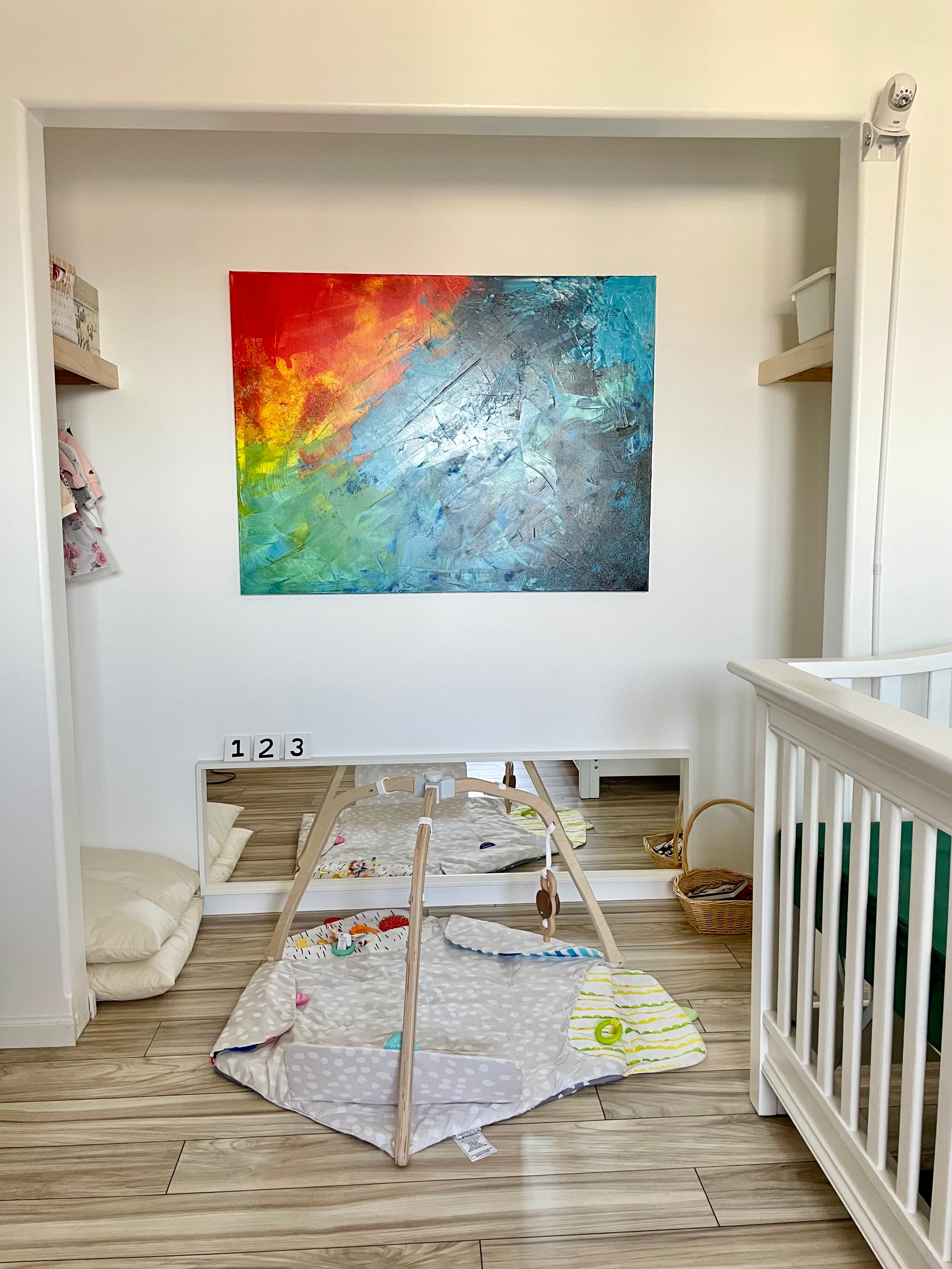
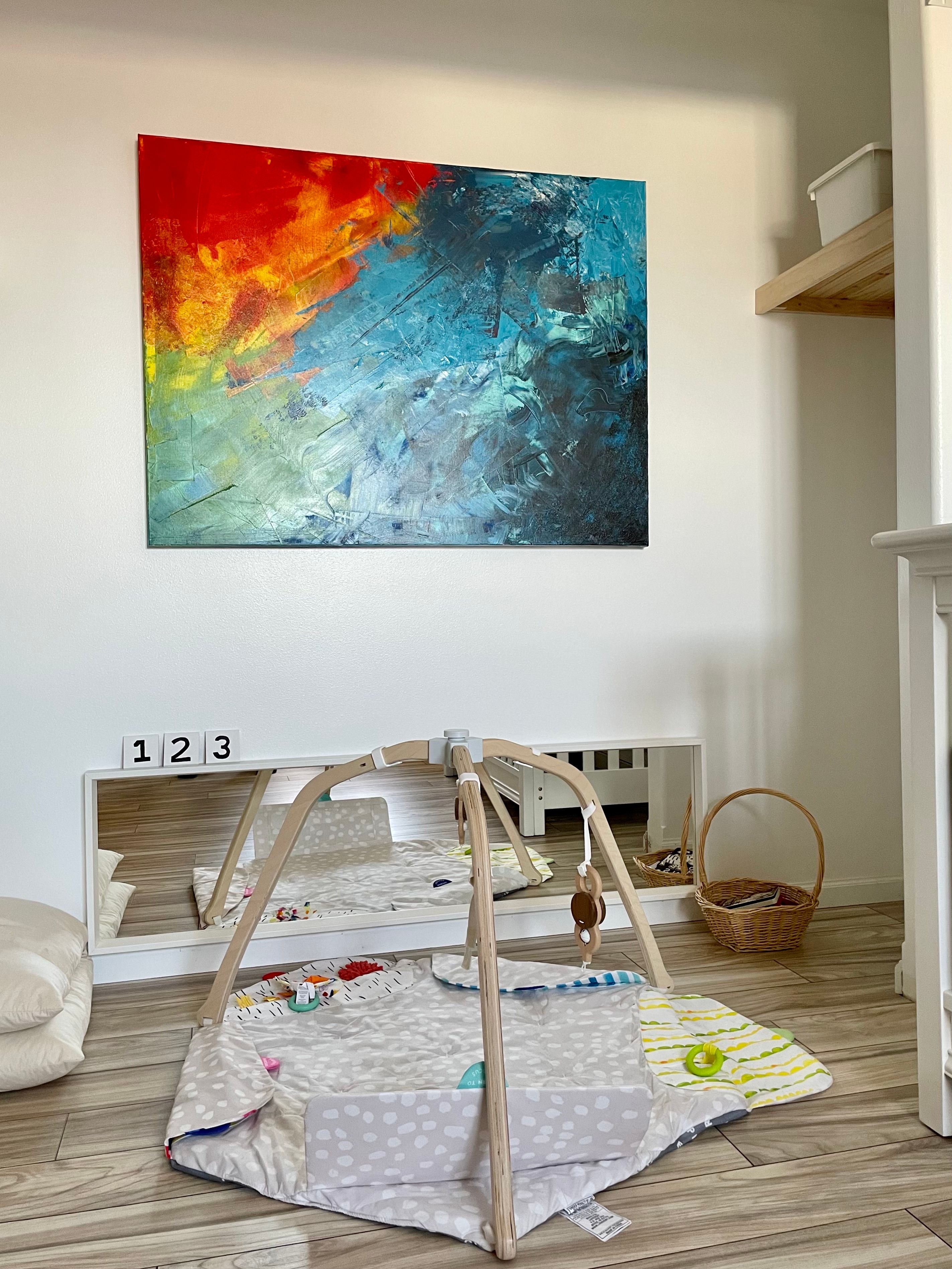
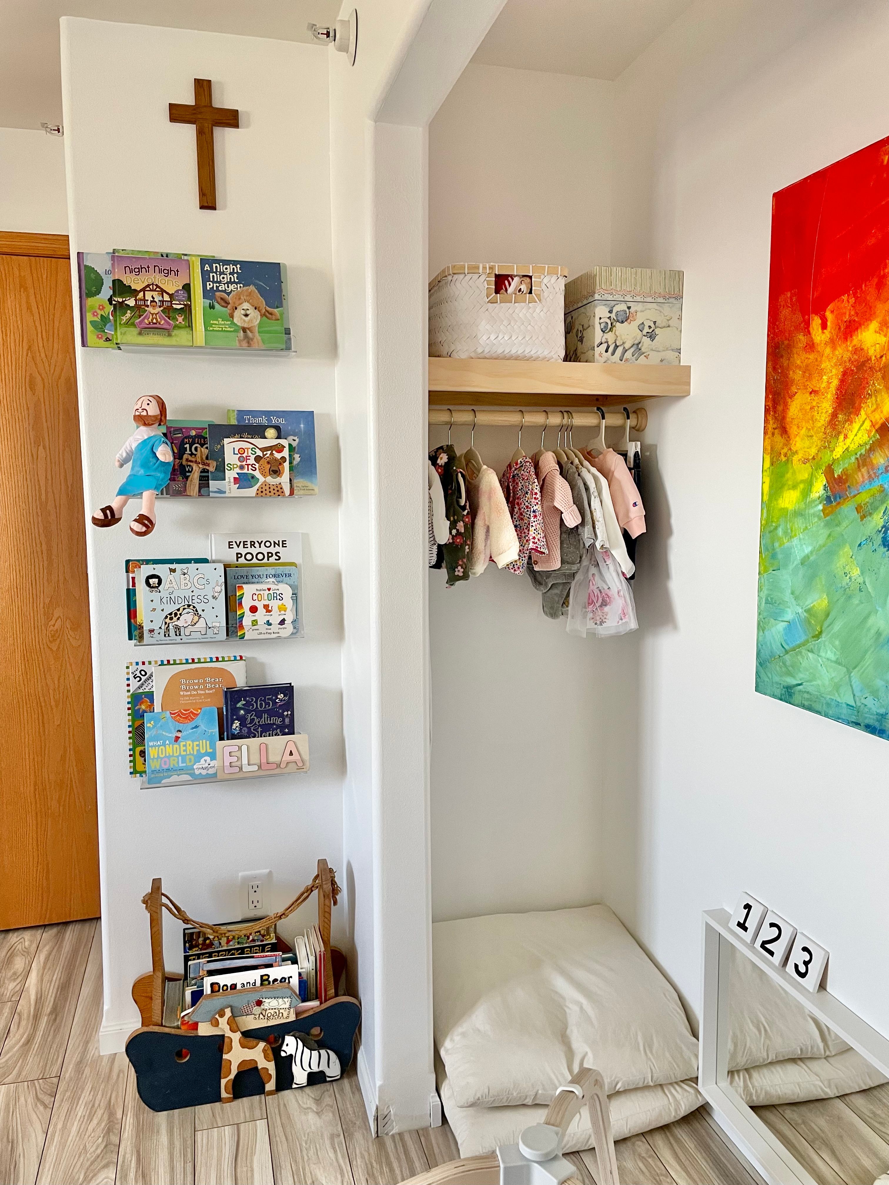
As of now the nursery does not match a complete Montessori style. We are considering swapping the crib with a floor bed. Since Ella is already rolling over, we are considering making room for a changing station on the floor. Having her up high makes me a little nervous even though we use the changing mat buckle. On the sides of the closet , Bennett plans to build a shelf for Ella’s activities (you can see the empty spaces in the photo above). At the appropriate time, we will add a bar in front of the mirror to offer her the opportunity to stand. When Ella is able to stand up, we will move the clothing rod lower for her to pick out a clothing item. When we make any of these changes, I’ll post updates over on my instagram along with a blog post. For now, you can see the full nursery in my IG reel and find many of the details below(We swapped the brown chair with a different one. See below).
Nursery Details with Links
The process of the changing table
Book shelves We bought 15 inch long shelves.
The nightstand is from IKEA
Emma glider from Target.


